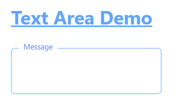
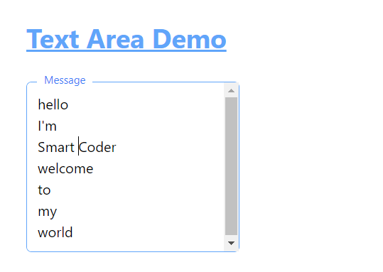
Tailwind custom TextArea component with auto grow height feature. Like Material UI auto size textarea component here is a similar Autosize TextArea using Tailwind CSS.
import React, { useState, useEffect } from 'react';

const AutoGrowingTextarea = ({ placeholder = "Title", maxLines = 5, minHeight = "3rem", maxHeight = "15rem" }) => {
    const [textareaHeight, setTextareaHeight] = useState(minHeight);

    // Function to handle textarea resizing
    const handleResize = (event) => {
        const textarea = event.target;
        textarea.style.height = 'auto'; // Reset height to allow shrink if needed
        let newHeight = textarea.scrollHeight;
        let maxHeightPx = parseInt(maxHeight.replace('rem', '')) * 16; // Convert rem to px if needed
        if (newHeight > maxHeightPx) {
            textarea.style.overflowY = 'auto'; // Enable scroll
        } else {
            textarea.style.overflowY = 'hidden'; // Hide scroll
        }
        textarea.style.height = `${Math.min(newHeight, maxHeightPx)}px`; // Apply new height within limits
    };

    // Function to manage label style on focus
    const handleFocus = (event) => {
        const label = event.target.nextElementSibling;
        label.style.transform = 'translateY(-100%)';
        label.style.fontSize = '0.75rem';
        label.style.color = '#3b82f6';
    };

    // Function to manage label style on blur
    const handleBlur = (event) => {
        const textarea = event.target;
        const label = textarea.nextElementSibling;
        if (textarea.value === '') {
            label.style.transform = 'translateY(0%)';
            label.style.fontSize = '1rem';
            label.style.color = '#a1a1aa';
        }
    };

    useEffect(() => {
        setTextareaHeight(minHeight); // Initialize minHeight when component mounts
    }, [minHeight]);

    return (
        <div className="relative float-label-input">
            <textarea
                id="name"
                placeholder={placeholder}
                className="block w-full bg-white focus:outline-none focus:shadow-outline border border-gray-300 rounded-md px-3 appearance-none leading-normal focus:border-blue-400 resize-none"
                style={{ height: textareaHeight, overflowY: 'hidden' }} // Initially hide scrollbar
                onInput={handleResize}
                onFocus={handleFocus}
                onBlur={handleBlur}
            />
            <label
                htmlFor="name"
                className="absolute top-2 left-3 text-gray-400 pointer-events-none transition-all duration-200 ease-in-out bg-white px-2"
            >
                {placeholder}
            </label>
        </div>
    );
};

export default AutoGrowingTextarea;
<AutoGrowingTextarea placeholder="Text" maxLines={5} minHeight="3rem" maxHeight="15rem" />
The above is the code for material UI style auto-sizing textarea using tailwind CSS for react apps.